| Fast Facts: |
|
|
Let the questions commence... |
|
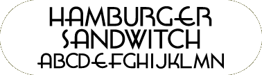
Why did you create Font Diner? Where did the name originate? When I was a print Art Director in Milwaukee, I always loved type. Yes, I’m a total font geek and I look for type and fonts everywhere! The only problem was the only fonts I knew existed to design with were from ITC, Adobe, or Letraset via a little catalog then called Image Club now Eyewire. The Internet was very new to me and by a suggestion of another Art Director I decided to try and hunt down cool fonts. I ended up spending hours on the search engines with very little luck. Then I came across Fonthead Design. This was way back in 1996 when Ethan only had 2 Font sets. And from that point, I was absolutely driven to make my own font site! I wanted to do something that was going to be memorable, and develop type that I really thought I’d like to use. Also during this time, CSA Archives came out with the first Retro Clip Art library of stock illustrations. I was so inspired by the style which I absolutely loved, it occurred to me all this great clip art needs great fonts! And so began the quest to create retro fonts. Now if I could only think of a catchy name. . . There is no specific diner that inspired me to create a diner, but my thought at the time was to create a place (retro themed) that would be a place to come and satisfy your hunger for great retro type. Also I fell in love with my concept of referring to Freeware as Silverware (the pun being the only thing free you can take from a diner) And by the end of 1996 the Font Diner was born! Is this your first foray into webpage design? Yes, but the Font Diner went through huge development cycles over a course of weeks and months (Brain Eater Brad can tell you . . .) The graphics give the site real character, are they yours? All of ‘em! You’ve received quite a bit of recognition for your work. Appearances in "Publish" magazine, the Milwaukee Addy Awards, numerous sightings ranging from Mounds candy bar to graffiti. How does that feel? It makes me feel just awesome! I perceive type as a vehicle to communicate an even stronger message than what the message actually says, and when a designer is inspired to create their message with my type. I feel like a very important part of the communication process. What fonts were used throughout Font Diner? Why were those fonts chosen? In the first few months of the site, I was using fonts by Chank, Leslie Cabarga, and Adobe. After a while and a few font sets under my belt, I simply felt it was wrong of me to use other foundry’s fonts for the site design if I’m trying to promote my own fonts for purchase. The Font Diner offers the Doggie Bag and the Brown Bag font sets. How popular have these been for you? They have been extremely well received by many people. It was my goal when I started the Font Diner to appeal to ALL computer users, not just designers. And when I hear positive comments and feedback by designers as well as non-schooled designers, I am very proud to have been able to inspire them to get more out of their passion to design. Why were the fonts that are included in each set chosen? I had several goals in mind with each set I developed. As I researched out the style of the 1930’s to 1960’s, I found several consistent elements. There is the classic connecting font, (ala: Permanent Waves, Continental Railway), a straight clean stylized display font (ala: Hamburger Sandwitch, Milwaukee, Lionel Classic), several fun display faces (ala: Kentuckyfried, Taylors, El Niño), and I also wanted to make a few experimental faces that stretch my creative ability to develop fonts that aren't a part of my typical rapport (ala: Yarn Sale, Motor Oil, Anastasia, Finer Diner, Etiquette) How would you describe each font set? The Doggie Bag is an aggressive successful first effort at font creation. Several fonts are inspired by people, music, and food products. While it doesn’t scream retro, it does offer a lot of nice variety. I’d say it’s the cereal variety pack of fonts. The Brown Bag is a more refined and thoughtful effort taking almost half as long as the Doggie Bag to create, the forms are truer to the retro era’s, and the feeling comes through brilliantly. What are your future plans for Font Diner? I’m focusing a lot of effort and attention on the Diner as I plan to produce more font sets on a very aggressive timeline. I’m also planning a site update both graphically and HTML code wise. But in the next month, you can look for the TV Dinner font set that I’m very proud of and I think all retro fans should own a copy. What programs were used in the construction of Font Diner? Adobe Illustrator 6.0, Adobe Photoshop 4.0, Adobe Pagemill 2.0, BBEdit 4.5.1, Macromedia Fireworks, and Alien Skin Eyecandy 3.0 All these versions and tools are planned for the updates of the site. What do you wish to accomplish with Font Diner? I wish to inspire others and create a sense of community and belonging. I’d like the Diner to continue long after I do. Who was the most annoying; the Brady Bunch or the Partridge Family? Why? Definitely the Partridge Family! Sure we can all name a song or two, but do you remember any plots? Besides, Susan Dey didn’t look hot until LA Law :D When did you first become interested in fonts? When I was in art school designing my first resume, Ahh Huxley Vertical! How do you generally create your fonts? Do you use pen & paper or do you scan them? The Doggie Bag fonts were mostly pen and paper. Some letterforms were scanned and enlarged for reference, but the old draw, scan, autotrace, and viola was the first method. I even used the first Macromedia Flash to create Etiquette The Brown Bag fonts were mostly created from scratch in Illustrator only a few were autotraced, and one I filtered with Expression. Regardless of the font creating method, I basically draw many different words in the style I think they should appear. When I find the word that really looks best in the face I’ve created, I then develop the basic character set (A-Z a-z 0-9). Most of the time, the name inspires the font, but many times the font has inspired the name. Do you have anything playing in the background whilst you create your fonts? Always in the forground! This is a discussion that came up in one of the type news groups I subscribe to. Lately I’ve been in the groove of Kamikiriad by Donald Fagan – favorite cut -Florida Room. I’m currently enjoying the new Ben Folds Five CD – My favorite cut is Regrets. I will often listen to the entire CD, sometimes I’ll just repeat one song all day. The key is finding the groove that puts you in the right mood. Believe it or not, making fonts isn’t as difficult as forcing yourself to sit down to the computer and just make fonts.
Which font of your own making do you consider your favorite? Least favorite? Why? Tough question, My favorite font would have to be Hamburger Sandwitch so far. I love the classic shapes and really retro feel. Least favorite would have to be Finer Diner. It started out really nice on paper and great on the computer, but as a font, I’ve never really felt it worked the way I had expected. Fontdinerdotcom Sparkly has become quite popular recently. What’s new on the Mounds commercial screenshot search? We got it! I posted it to the site a little while ago, and I’m debugging a few things about the movies now. You can view it online; it looks and sounds great! Has any other Font Diner font made ‘the big time’? Disney’s Inspector Gadget was released in the summer, and Lionel Classic can be clearly seen in one scene where the inspector hits a button in the Gadgetmobile that says "HYPERDRIVE." Lionel Classic was used on all of the Gadgetmobile interior buttons. What is the criteria for deciding whether a font gets to the freebie ‘Silverware’ section or gets to be one of the, for purchase, font sets? I always know when I’m developing free fonts or pay fonts; the processes are cyclical. For instance, I may be busy making a ten set, which keeps me busy for a few months and also makes me absolutely focused on getting just that set complete. When it is complete, I’m then in good shape to start working on some freebies. Things I see and do (Font-On-A-Stick, Font-On-A-Grain) usually inspire most free fonts. I do want to create good free stuff because I remember scanning the web many years ago for good free fonts and always being disappointed in what I found. Most of it I couldn’t really use for designing with anyway. In your opinion, what makes your fonts stand out from the rest? I think they are the only fonts that are as genuinely retro as CSA Clipart without being scanned in from old Dover books! What font(s) other than yours, would you consider your favorites? I have always loved and been inspired by the work of House Industries. It’s fun, it’s clean, and it’s fresh and generally very well done. Do you remember the first font you ever downloaded? What was it? Eddie Fisher by the Brain Eaters Font Company! (it’s no coincidence he’s on the site) What fonts, yours and others, do you use most? Professionally, I really only use my own fonts about 20%, as they aren’t that applicable to the work I’m designing. They definitely scream out retro and I don’t get to design that much retro stuff, but I sneak it in when I can! Of my own, I find the Taylors font is the one I design with the most. Among other foundries, I use Futura and Apple Garamond a lot. What feedback have you received from your website and fonts? Most very positive, I hear from people using the fonts for newsletters, CD artwork, and themed parties. Both the site and the fonts get a lot of very complimentary e-mails; some go as far as to be written in the voice of a diner waitress. On the not so positive side, I do get a handful of e-mails from people just looking for free stuff and not spending any time reading the site long enough to find out that Silverware is freeware and there are plenty of freebies there. I’ve tried to make it as obvious as I can without ruining the fun of the Silverware concept. Which of your fonts has received the most accolades? Which has been the least popular? Actually, most people are very appreciative of Fontdinerdotcom and Fontdinerdotcom Sparkly. They look cool AND they’re free! The least popular would be Yarn Sale or Anastasia - I haven’t ever recalled anyone saying it’s their favorite. Any future fonts in the works? The soon to be famous TV Dinner font set! It’s a blend of classic looks, script fonts, and really over the top themed display fonts that are as cool as the center of aluminum TV Dinner brownie! Describe the Brain Eaters Font Company. Is it an offshoot of the Font Diner? A collaboration? A separate entity? To view the origins of The Brain Eaters Font Company go here (http://www.fontdiner.com/braintalk.html) The first font I downloaded and paid for was called Eddie Fisher. I can’t recall where I saw it, but it was the perfect mix of style I needed for an ad I was working on for a public television station auction. (this was before I began designing fonts). The only problem was, I needed the fonts before I could get the agency to cut a P.O. or check to pay for them. Brain Eater Brad Nelson e-mailed me the fonts on good faith and I dropped his check off to him a week later. Brad had been doing the Brain Eaters for about 2 years or so before I met him. He had quite a large volume of really nice classic B Movie and Horror fonts created. When I decided to create the Font Diner, I asked Brad if he had a home for his fonts on the "Information Superhighway" way back in 1996. And I knew I couldn’t begin building a font site without some fonts for people to see. Brad agreed to let me put his fonts online as the Brain Eaters online and has been part of the Font Diner ever since. He is a separate font foundry and we don’t share money or customers. He brings a lot of nice type designs, a great motif, and a really wicked sense of humor to the site. He is a big part of what makes the Font Diner what it is, and the ironic part of the whole thing is, I’ve never met him in person! I notice you live in Minneapolis, have you ever met Chank Diesel? Yep, when I lived in Milwaukee and was on a job hunt in 1997, I planned an impromptu visit to Minneapolis to interview with a few different firms and meet Chank. That was definitely one of the planned stops on my visit. I had discovered his site just months before and really was inspired by his designs and the very entertaining voice of the site. This is when he used swear words and told really cool stories that you never knew if they were real or not. My buddy dropped me off and I spend a couple hours with Chank. I was full of questions, and I’m pretty sure he thought I was conducting an interview. I mostly watched him working in Fontographer on a font for a Tripod font giveway. I brought him a little Font Diner bundle of the cool little toys I send out with my fonts and a french fry pen. We drank black coffee and glazed donuts. As my buddy returned to pick me up, Chank invited us to fold some freshly copied Kinko’s font catalogs and we took off. Right before I left, he asked me to mail a package for him to some weird address and handed me a sealed envelope with a Lucky Font Disk inside. He's based in the California Building?? Ever been there? Yep! It's about 2 miles from my apartment. I’ve met with Chank during the Art-A-Whirl (Minneapolis Northeast gallery crawl). His new studio is very cool. It’s got a lot of space and a beautiful panoramic view of the city. Believe it or not, we never really talk about fonts when I see him. Has he ever been to your place? Nope, but I may invite him up for a pint of Guinness! And why is Minneapolis a mecca for type designers? I would say with anyone who enjoys a hobby for example, naturally seeks out those with similar interests - It’s really a very intimate community. First I met Chank, through Chank I met El Mack who introduced me to Mike Cina who introduced me to Joe Kral (we all went to Typecon 98) and was introduced to Matt Desmond through Mike. Matt works with me at Risdall Linnihan Advertising Interactive. What was your first computer? What kind of processor/memory/hard drive did it have? I had a Texas Instrument TI-994A. My buddy Danny Taylor had the Advanced Basic Cartage. Otherwise, it would have been an IBM PC I can’t even tell you what kind of processor it had. But I learned Advanced Basic and programmed all of the stuff from the Family Computing Magazines! 10: Input "What is you name";A$ 20 Print A$; 30 Goto 20 Ahh, ya gotta love it! My first REAL computer was an Apple Performa 6300CD with 100Mhz 1 Gig drive, 16Mg or RAM! When I bought it I was pleased, but that feeling quickly disappeared as soon as I got a new machine at work. The Font Diner and all fonts were created on that machine! What other font sites would you recommend to someone who’s just entering the cyber world? House Industries, Chank, Test Pilot Collective – not my bag, but I know these guys! And of course the True Type Resource! I was surfing you long before you were surfing me! :D What’s the biggest innovation or change in the world of fonts that you’ve noticed? The fact that there are so darn many now! When I was graduating art school in 1993, I only knew of the Letraset Press Type guide as the ONLY fonts created, now I know of at least 100 foundries. What do you think will happen with the Y2K problem? Companies will spend a lot of money on IT people and Media campaigns to declare their Y2k compliance. People will enjoy sunny warm mid-winter vacations, and we will probably forget about it in a month. Where do you see the Internet ten (10) years from now? I see it being more like TV with hotlinks on the stuff you are interested in. More artificial intelligence – search engines and online assistance that contact you to remind you of appointments and schedule your bills, your groceries, and perform tasks that one may find time consuming now. It’ll be much like when TV was created. If you’re not on in the next 10 years, you’re missing out. And from an advertising perspective, most advertising agencies and marketers will have established the Neilson ratings system for the web and be able to buy media accordingly. This has not been the case so far. Who would most likely be in a 12-step program? Sneezy, Dopey, Doc, Bashful, Sleepy, Grumpy, Happy or Snow White? Why? Snow White, I mean think about it, she takes a poison apple from a stranger – that’s gotta mess with your head a little. What really bugs you about the font industry? As an industry, there hasn’t been a real push to speak to the public. Fonts are so important in our lives; they should be recognized as being as important to communicating a message as the message itself. If you think about the size of the web, and the number of users, we all use fonts, but only a few hundred thousand are really into fonts. It’s really a small percentage. How do you handle the inevitable, "Do you have/Do you know where to find font" requests? If I feel I’m qualified, I’m happy to reply, a lot of people are seeking the same stuff I did. Otherwise, I at least try to point them in the direction of search engines or foundries. What's your biggest non-font pet-peeve? People who wear too much perfume or cologne. Have you made any noteworthy contacts through the Internet? Yes! In no particular order: Old Navy, AGFA, Leslie Cabarga, House Industries, Ethan Dunham, Brad Nelson, Michael Want, Cynthia Malaran, Andreas Lindkvist, Chank!, El Mack de los Toros!, Matt Desmond, Mike Cina, Joe Kral, the gang at Typecon 1998. How have your Internet experiences been in general? Overall, I find if you ask questions, most people are happy to answer, and I ask a lot of questions! So, what 's a typical Stuart Sandler day like? Weekday – work from 9:00am to 6:15 or so. Eat dinner. Work on Font Diner stuff or get away from the computer depending on my mood that day. Weekend – spend it with friends and loved ones. How would you describe your style of design? Clean. Thoughtful. Communicative – (I may have invented that word, but it has an ability to communicate to the audience I’m trying to reach.) Who are your influences? In no particular order: Sting, Donald Fagan, Vincent Van Gogh, Thomas Edison, My Dad, Everyone in my daily life. Have you ever been to Camp Fitch? Well, search engine sleuth, you’ve done well . . . Yep, it was a camp I went to for many years as I was growing up. First as a camper, then a C.I.T. (Counselor in Training), then a Dishcrew member and finally a counselor. I even heard from one of my campers a few months ago. This was my social opportunity to score with chicks since I had no reputation and could be whomever I wanted. I stopped going to camp when the rules of a YMCA camp made it impossible for me to enjoy myself and it begun to feel like a job. I still have many friends I keep in touch with from camp and look on those years warmly. If only the strong survive, how will the meek inherit the Earth? Geddy Lee answers this question in 2112 by Rush! What is your philosophy? Do what you love and share it with others. What makes you laugh? Genuine experiences. Comedy that occurs as your day unfolds. What do you want to accomplish? The way people appreciate art or music – new generations rediscovering work from earlier generations. I’d like to create work that is profound enough to do that. What makes you want to create a font? What have been some of your inspirations? ALL of the fonts have been inspired. Usually something or someone very specific has inspired my favorites. I get asked all the time who Jack Bisio is, or why Hamburger Sandwitch is spelled wrong, and what is the recipe for Beer Dip? Truth be told, I’d prefer you to draw your own conclusions – Your Jack Bisio is probably as hip as mine is! What obstacles do you encounter while creating your fonts? Very simply put, time! There’s never enough time to work on the fonts or the site. What letter presents the most problems? I’ve always hated creating the letters K,k,R, and B. They are just very difficult to make work well within a font family. Do you have any guilty pleasures? Mine is listening to ABBA (only on occasion). Cooking – I love it! I’ve always loved to cook! Especially recipes from Top Secret Recipes. Buy the books – I’ve e-mailed with the author! Have any commercial foundries offered to buy the rights to your artwork or fonts? I’ve never sold any fonts for buyout arrangements, but I have created custom logos, designs, and artwork that I’ve sold. If you go to the Homemade specialties page, I’ve created the logo for Muddy Waters – Caffeine Canteen. And I currently distribute some of my fonts through the AGFA Creative Alliance. This gives my fonts the opportunity to be seen by a larger audience. Have you ever purchased a font? Yep, all the time – when I can’t make ‘em! (wink) What is your opinion of commercial font sites in general? It’s very difficult to find what the fonts look like – most foundries make you click 4-5 times before they let you see the font. I have always tried to make it less than a few clicks to the fonts. Do you wear boxers or briefs? Boxerbriefs. – (Banana Republic) Your Turn: Ask yourself the question nobody ever asks you, then answer it. Q: What would you say to anyone who doesn’t feel happy about where they are in life professionally? Pretend you were a caveman (or cavewoman) and the system of currency hadn’t been invented yet what would you do all day long? (my answer to this one is make fonts and music) Then, do that!
Thanks for spending some time with us... |
Interview conducted December 26th, 1999 by Jami (True Type Resource). Interview copyright 1999 FontFrame & True Type Resource. All rights reserved. Questions? Email us.